German post was automatically translated by DeepL and manually reviewed
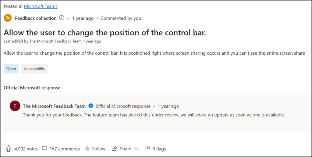
If someone shares their screen during a Teams meeting, the Presenter toolbar is in the middle at the top of the screen. At this position, the bar is usually unfavorable and covers something else. Various posts in the Teams feedback forum ask for the bar to be moved.

The latest Teams Public Preview for Windows and Mac supports moving this toolbar. It should be available globally by the end of June. Teams Classic does not support this option.
While sharing, click on an inactive area of the Presenter Toolbar, and you can move the bar anywhere on the screen, for example, to the bottom or, if desired, to the center.

Furthermore, Teams minimizes the toolbar automatically after 4 seconds of inactivity.

Microsoft describes the new option in the blog.
When sharing content during a meeting, presenters can reposition the Presenter Toolbar from its default location at the top of the screen to any other area of the shared screen by moving it to the preferred position. The Presenter Toolbar can be dragged from any non-interactive area as well as from a new drag handle.
Also, the Presenter Toolbar will use minimum space by collapsing when not in use after a timeout of 4 seconds. When collapsed, a red badge showing the sharing status will still be visible to clearly indicate the ongoing sharing session.
